- Discuss the artwork that stands out most to you from the exhibition and why you like it/don't like it
- Try to find interviews to back up what you want to say about the artist
- Find out about the gallery at which the exhibition is being held as a lot of galleries only display certain types of work.
- what issue is the artist trying to portray in their work? what makes it uniique
- Make sure to write in 3rd person
- Opinions need to be backed up with evidence
- Magazine layout ? A title that engages reader ?
Tuesday, 30 April 2013
How to write an Exhibition Review
I have never written a exhibition review quite as long or as formal as this one before so decided to research some tips of how to write one. I have read other reviews such as the ones in source magazine and although they give you some idea I felt some more structure would be helpful.
Tuesday, 16 April 2013
Exhibition Review- Chuck Close: 'Process & Collaboration'
Chuck Close is an american painter who is most known for his photo-realist approach to his portraits of family and friends but in 1988 was paralyzed by a spinal artery collapse and is now in a wheelchair but amazingly that never stopped him from making work. His illness forced him to find a new way to work so had to move on from his detailed photo-like paintings so now works in a more abstract way.
This exhibition was held at The White Cube Bermondsey in London from the 6th of march until the 21st of April. This is a newer gallery as it only opened in October 2011 however it is the biggest of all of The White Cube galleries. It has 3 major exhibition spaces and also has a book shop which is rather handy as art book are not exactly the easiest to get hold on in a regular book shop. To go along side the exhibitions they also run lectures in their 60 seat auditorium so it is great for those in education. Although it is great because it displays work of very well known artists it is focused on making money rather than getting artists known in the world.

I have admired Chuck Close's work for a long time as although I'm studying photography I tend to find myself more inspired by artwork and I think his work shows a lot of skill. The piece that I've always loved is 'Emma' which he created in 2002 however what I did not realize was that he had a few different versions using oil paint, watercolors and woodblocks.His work is one of those must-see because its even more incredible in person especially as they are large scale pieces so they have a great impact in an exhibition than a book.
http://whitecube.com/
Book: Chuck Close (Exhibition),1998-1999 :Museum of Modern Art http://prism.talis.com/jersey/items/226834?query=chuck+close&resultsUri=items%3Fquery%3Dchuck%2Bclose
This exhibition was held at The White Cube Bermondsey in London from the 6th of march until the 21st of April. This is a newer gallery as it only opened in October 2011 however it is the biggest of all of The White Cube galleries. It has 3 major exhibition spaces and also has a book shop which is rather handy as art book are not exactly the easiest to get hold on in a regular book shop. To go along side the exhibitions they also run lectures in their 60 seat auditorium so it is great for those in education. Although it is great because it displays work of very well known artists it is focused on making money rather than getting artists known in the world.

I have admired Chuck Close's work for a long time as although I'm studying photography I tend to find myself more inspired by artwork and I think his work shows a lot of skill. The piece that I've always loved is 'Emma' which he created in 2002 however what I did not realize was that he had a few different versions using oil paint, watercolors and woodblocks.His work is one of those must-see because its even more incredible in person especially as they are large scale pieces so they have a great impact in an exhibition than a book.
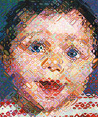 |
| Emma,2002
Although I am normally not the biggest fan of such a clean layout gallery I felt this one worked because although still on white walls it had a classic but simple layout and was not over packed with work but it just felt fitting to chuck closes work. I would happily go back here to see other artists work as they kept it simple yet professional.
|
Sources:
http://whitecube.com/
Book: Chuck Close (Exhibition),1998-1999 :Museum of Modern Art http://prism.talis.com/jersey/items/226834?query=chuck+close&resultsUri=items%3Fquery%3Dchuck%2Bclose
Exhibition Review- Ansel Adams: 'Photography from Mountains to the Sea'

This exhibition of Ansel Adams work was held at the national maritime museum in London from November 9th 2012 until 28th of April 2013 which is a long time for an exhibition to be held but for someone so famous and influential in photography it is a must see exhibition.
The piece of work that stood out the most was his large triptych due to the scale of them and they were near enough in the center of the exhibition space however it could be questioned that they really work best as individual pieces as appose to a trip-tic. Triptych normally fit together much better then these did it was like Adams' just printed his all time favorite 3 photographs in large scale because he could. Having said that they way he made each image was quite outstanding especially for the 1950's. Adams' did this by hanging large sheets of unexposed paper on the wall and projected his image horizontally from the enlarger. These had to be printed in sections and joined on backing board.
Although this was the biggest piece in the exhibition is was no where near the most visually appealing one of the show. Several other prints such as his close up of a shipwreck titled, 'shipwreck series, lands end, San Francisco, 1931'. Adams uses the word extract instead of abstract as a photographer can only represent a moment in time however it can be selective. Well that's what drew me to this series how he had extracted something from such a big thing which really forces the viewer to focus on what happened giving very little sense of escape.

Walking into the exhibition and heading around the corner I noticed it was quite a large space but had lots of temporary walls put in which actually made it feel really small. The first thing I noticed was Ansel Adams quotes on the walls which I thought really added to the feel of the exhibition, it reminded me of an old Diner. The quote that stood out to me most was one Adams' wrote in a letter to his father in 1920,
Source:
http://www.rmg.co.uk/visit/events/ansel-adams
Although this was the biggest piece in the exhibition is was no where near the most visually appealing one of the show. Several other prints such as his close up of a shipwreck titled, 'shipwreck series, lands end, San Francisco, 1931'. Adams uses the word extract instead of abstract as a photographer can only represent a moment in time however it can be selective. Well that's what drew me to this series how he had extracted something from such a big thing which really forces the viewer to focus on what happened giving very little sense of escape.

"Wait and see what I can do with it- I may fall down completely:
Photography is limited, you know, but I am hoping for results."
He fills many people currently studying photography with inspiration in a way he that he says it wont be easy or a walk in the park but its possible so don't let anything get in the way. The exhibition felt quite mix and match but except for there being way too much in one room the different size photographs in all different frames ranging in thickness and colour, some black some white added character to the show. As well as the frames the wall colour were pastel colours and sepia tones which complemented the photographs. Most exhibitions you walk into have bright white walls that take the attention away from the artwork and identical frames which gives a more professional looking finish.
He fills many people currently studying photography with inspiration in a way he that he says it wont be easy or a walk in the park but its possible so don't let anything get in the way. The exhibition felt quite mix and match but except for there being way too much in one room the different size photographs in all different frames ranging in thickness and colour, some black some white added character to the show. As well as the frames the wall colour were pastel colours and sepia tones which complemented the photographs. Most exhibitions you walk into have bright white walls that take the attention away from the artwork and identical frames which gives a more professional looking finish.
Overall, except for them packing way too much work into one room which really put a downer on the experience of viewing Adams' work in person however saying that his work really does have a lot more impact in reality and books really do not show his work at there best so his work is really one of the few that going to an exhibition of is a must see.
Source:
http://www.rmg.co.uk/visit/events/ansel-adams
Morgan-Griffiths, Lauris, Ansel Adams: Landscapes of the American West, 2008
Tuesday, 26 March 2013
Exhibition Review- Julia Hugo: 'Reflections'

The other exhibition I visited at home for Easter holidays was by an artist Julia Hugo who moved to Jersey 10 years ago. 'Reflections' was inspired by experiences relating to her time in Jersey. This exhibition was held from Monday 18th March until Saturday 6th April. The process she used to make each piece of work involved layering images and textures in order to reach a completed image which creates depth and meaning to her paintings.


The painting that stood out was no.8 Crown which was not for sale unlike every other painting in the exhibition. It just did not seem as fitting in the exhibition but the detail was more accurate then the rest. The viewer was able to see the resplendence with Jersey but for once it was not straight up landscapes and seascapes, it was close up things giving some of the paintings a slight abstract feel to them.

Sources:
http://artscentre.je/event/reflections/
https://www.facebook.com/media/set/?set=a.508158762579353.1073741827.481860178542545&type=3
Wednesday, 20 March 2013
Exhibition Review- Graham Tovey: 'Paintings from the Edge'
The First Exhibition started on the 4th of March and ran until 16th of March. It was titled 'Paintings from the Edge' by local artist Graham Tovey. He is landscape painter who is highly influenced by Joseph Mallord William Turner, a famous British landscape painter. As well as making and exhibiting work Tovey also teaches art. He mainly works in oil paints with a palette knife which allows him to execute his work with speed and spontaneity. His painting are mostly of places in Jersey and France which he always revisits several times which helps him understand the place.
 |
| Turner, Peace-burial at sea 1842 |
 |
| Graham Tovey |
Overall I was more impressed with the exhibition then I expected to be as viewing the work made me understand his way of working. The colour and depth throughout his work was visually appealing and is the type of work I would expect to see in many homes but I don't think it is the most skillful artwork
I have seen.
Sources:
http://artscentre.je/event/paintings-from-the-edge/
Sunday, 17 March 2013
Exhibition Review- Matt Collishaw: 'This is not an exit'
This exhibition was made up of 14 detailed oil paintings, many of which were hung at an angle. Being hung at an angle must of been a way to draw attention to them. The angled paintings were defiantly the ones I noticed first, it is almost as if he wants you to read them in an order to make a story. Although I noticed the angled ones first by the end I was much more drawn the the colour and detail in some of the others.

Above left titled: Sinners, 2012 (detail), Oil on canvas, 225 X 225cm
I initially found his work drew me in as I walked into the white open space and although quite liked it had very little idea about the concept about it. While doing research on Matt Collishaw's exhibition I came across this film of him speaking about it which helped me understand his work much more.
http://www.blainsouthern.com/artists/mat-collishaw/multimedia/7

This quote from the Blain Southern gallery about Collishaw's work '... nothing is literal; the primary source material - magnified images drawn from the pages of glossy magazines - is a simple metaphor,..' reminded me about a lecture we had about Metaphors and Allegory and it is only now while writing this review the reason of having that lecture has become clear.
Metaphor: Representation that is symbolic of something else but does not literally apply.
Allegory: A story with hidden meaning not just the literal one.
Metaphors and Allegories are something that are used within every piece artwork as they always have more then meets the eye and it takes a lot to understand the concept of it. I know realize how helpful this lecture was as it helps us look at artwork as more then 'nice', everything has a reason for its making.
The first thing I wanted to know was the reason behind the title of this exhibition,'This is not an exit' which my first thought was there is no escape which is part of what he was trying to say and in fact he actually got the name of his exhibition from a film made in 2000 called 'American Psycho' when the man realizes there is no escape. Collishaw really emphasized no escape by creating illusionistic paintings which give potential to feel escapism into another world but its a flat surface.The scale of his paintings played a significant part to this as they were very large scale it helped you lose yourself in them which creates a field of void.

Sources:
Exhibition Review- Taryn Simon: 'The Picture collection'
 TARYN SIMON
Express Highways, 2012
47 x 62 inches framed (119.4 x 157.5 cm)
|
This collection was made to go with the online database 'Image Atlas' something she earlier created with computer programmer Aaron Swartz. It is made up of forty-four works found in the New York public library picture archive. The archive contains 1.2 million prints, postcards, posters, and printed images, most of which have been cut from secondary sources, such as books and magazines. Taryn Simon found it important to put well known images throughout history next to others that are by unknown artists in order to make the viewer question it and to tries to question the way in which contemporary culture works.

The gallery had a professional layout that you would expect to see with the white walls beaming, matching frames, photographs hung at the correct height and spaced out equally in the space. There is nothing good about this way out although its clear its just missing the excitement and I personally would hate my work to be in a gallery space like this. The white walls really draw the attention away from the work because your normally feeling quite blinded by the walls which is rather overwhelming.
Although I understand the idea behind her work I just dont see a college of lots of images a final peice for me its just a mood board and a starting point. This type of gallery is not what I enjoy because I just feel too fresh and perfect can take away from the quality of the work so I dont see myself going back there anytime soon.
|
Subscribe to:
Posts (Atom)